Lead Designer (Freelance)
Velocity Partners
Through their enterprise DNS platform, BlueCat Networks enables shared network visibility and control at some of the world’s largest and most successful businesses. After several acquisitions, BlueCat needed to incorporate the new technology offerings under a simplified and integrated brand.
I worked on the brand refresh and guidelines and laid the foundations for a new website.

Moving beyond refresh
What began as a brand refresh initiative quickly evolved into a more comprehensive revamp. Through an immersive workshop with stakeholders, it became evident that BlueCat’s identity required a significant overhaul to resonate with its evolving audience: technical decision-makers with little patience for marketing fluff.
Core identity elements
While undergoing a substantial transformation, certain core identity elements remained consistent with the previous iteration, serving as pillars of continuity and familiarity.

BlueCat’s iconic logo remained untouched
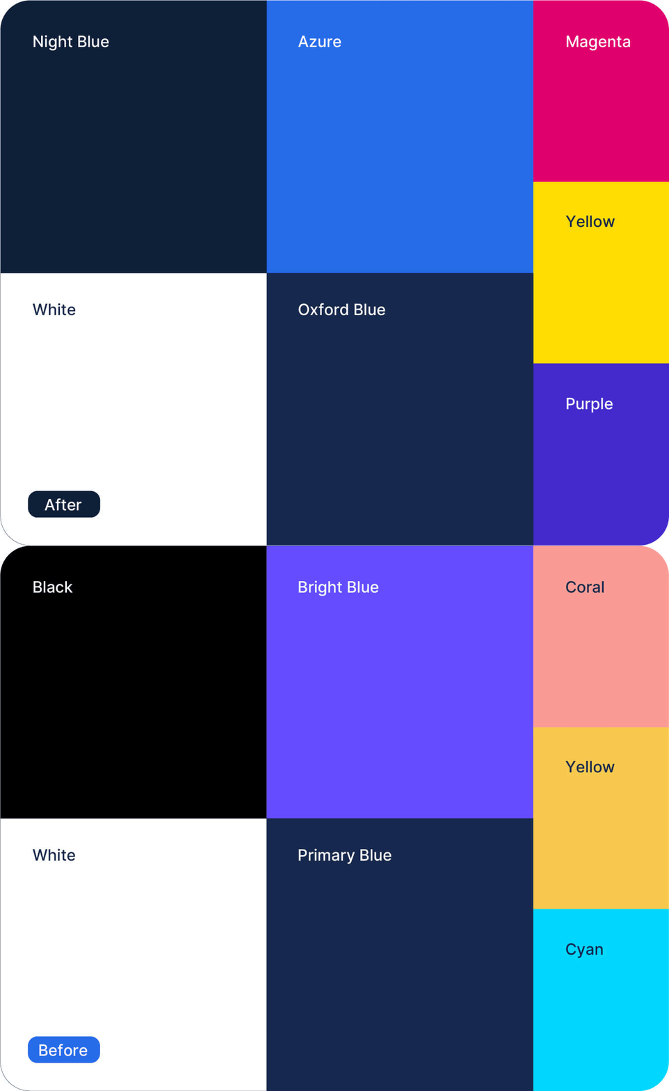
The colour palette was finessed and evolved to incorporate the acquired brand’s colours as accents while retaining its equity and relationship with the brand name.
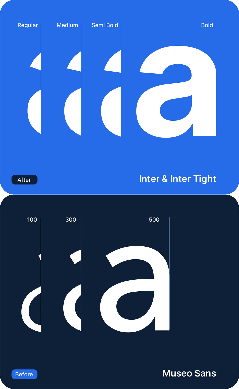
While the client considered retaining the previous Museo Sans typeface, it was ultimately replaced with a less elaborate font that better resonates with the brand’s technical audience.
Placing the product centre stage
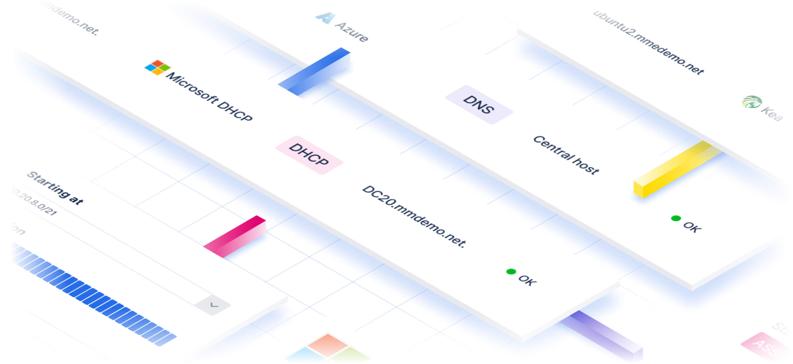
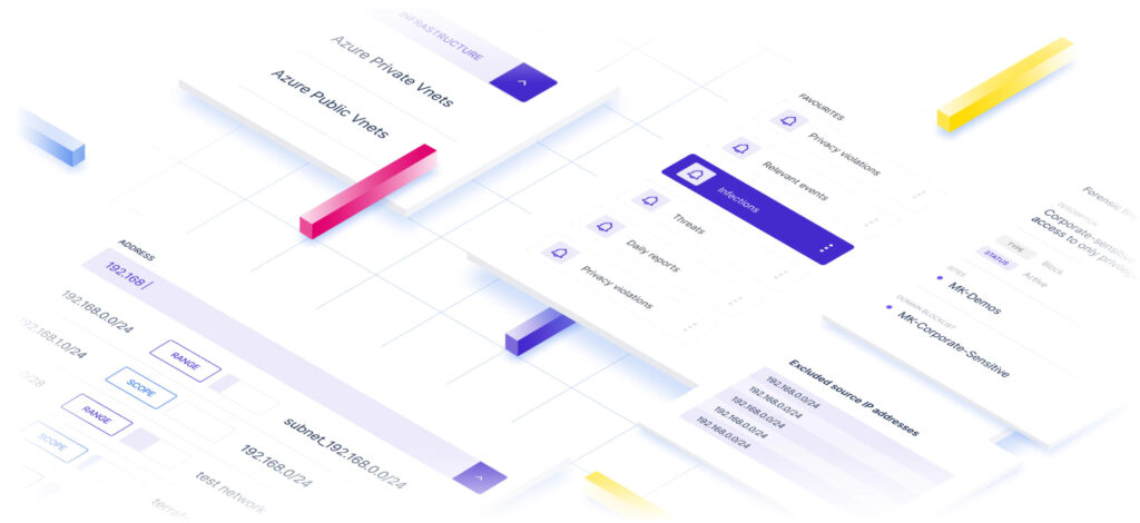
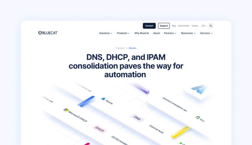
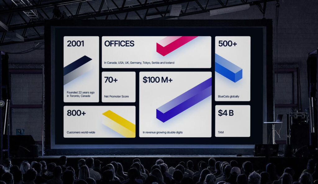
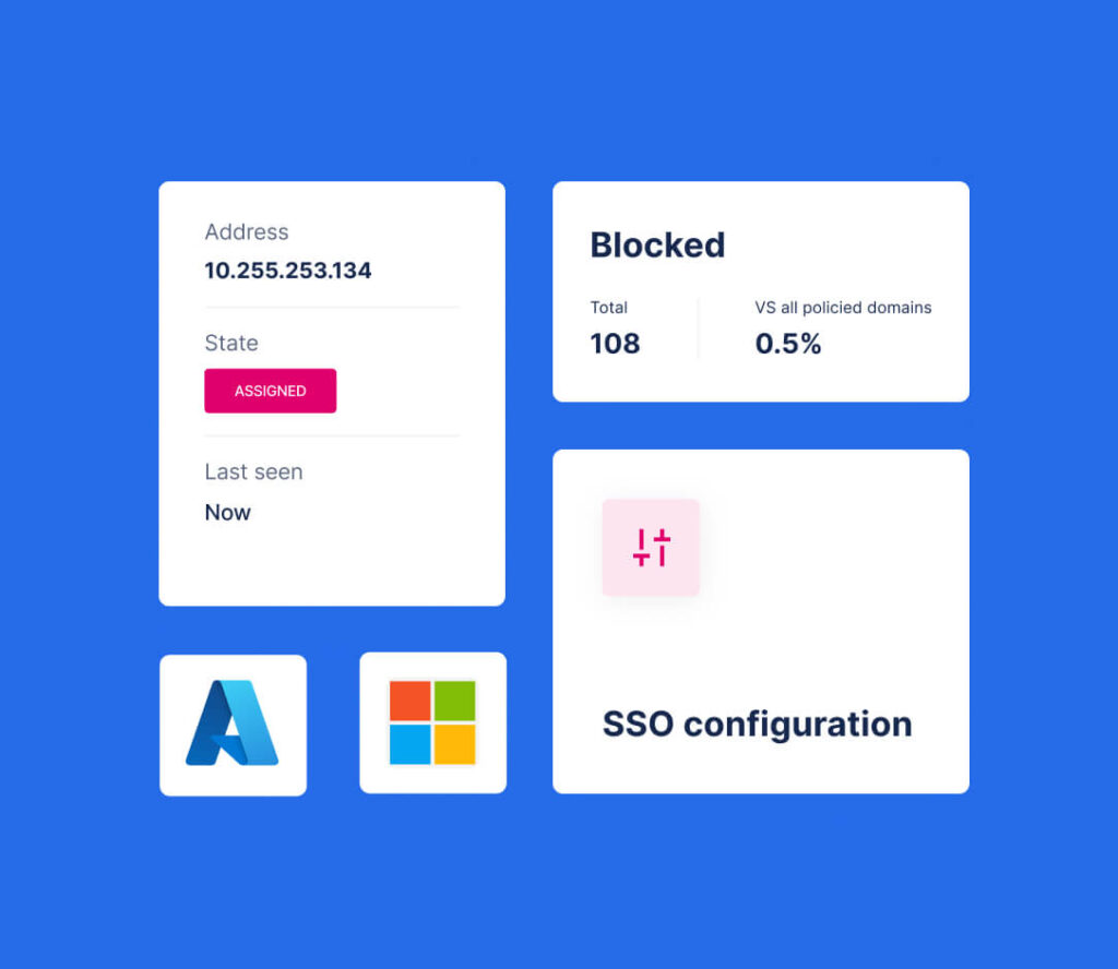
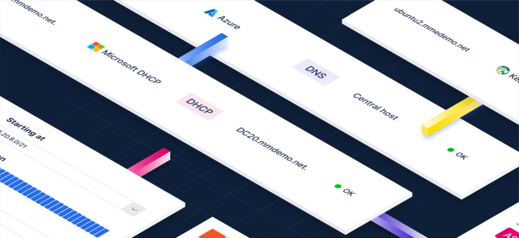
The most significant shift occurred in BlueCat’s visual language, with a product-centric approach. This led to the creation of the “BlueCat World,” an isometric representation of the environment in which BlueCat operates. Within this world, products emerge as heroes and the colourful “connectors” symbolise the seamless flow of connectivity facilitated by BlueCat’s solutions.
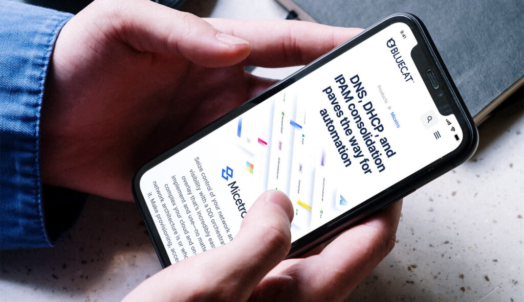


A visual language that places the product centre stage to complement a conversion-centric strategy




Website design
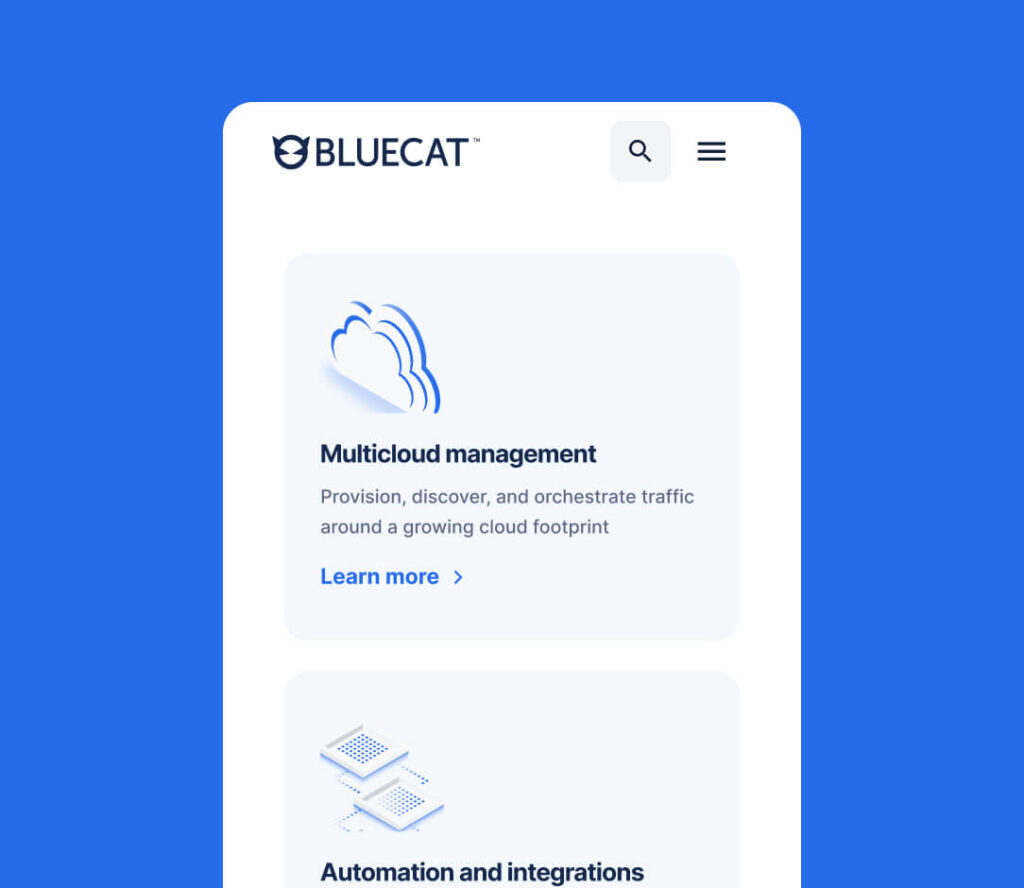
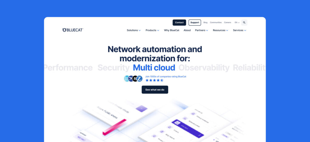
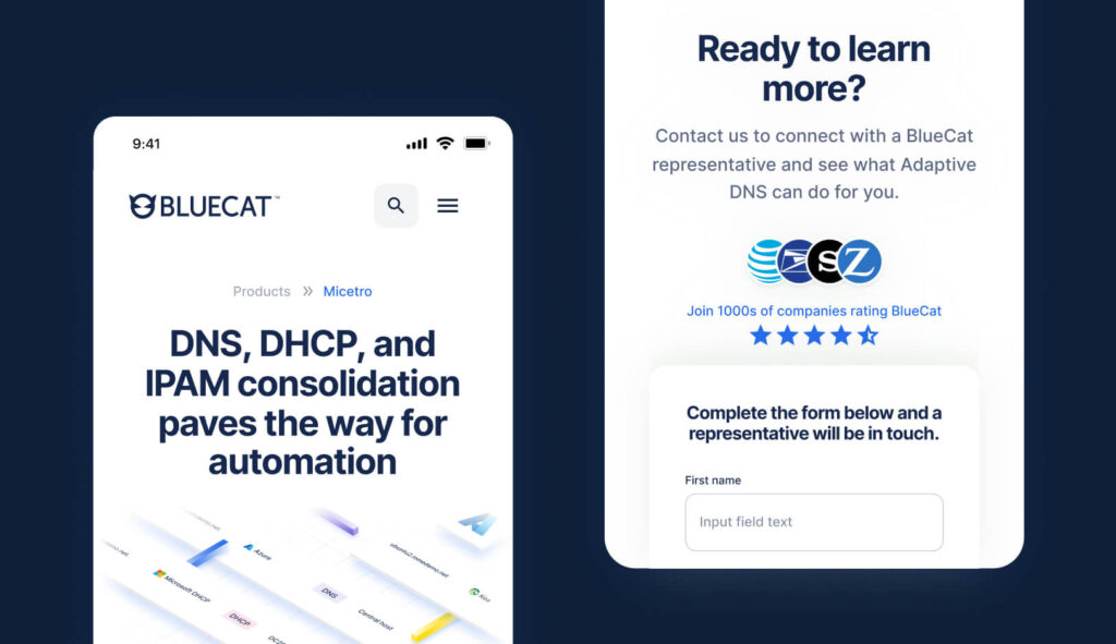
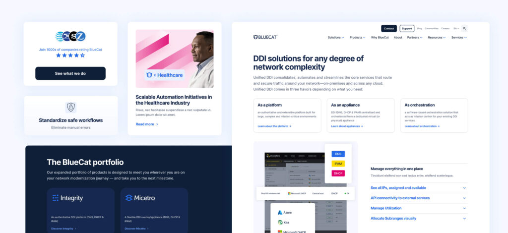
The design principle guiding BlueCat’s website redesign was simplicity. Designed for an audience allergic to marketing fluff, the website excludes all unnecessary embellishments in favour of a clean, documentation-style approach that highlights the features and benefits of the products.

Special to:
Andrea Dona, for pushing the website over the finish line. Whilst I worked on the concept, design system and initial page designs, Andrea took over once my consultancy ended to finalise the site before its launch.
