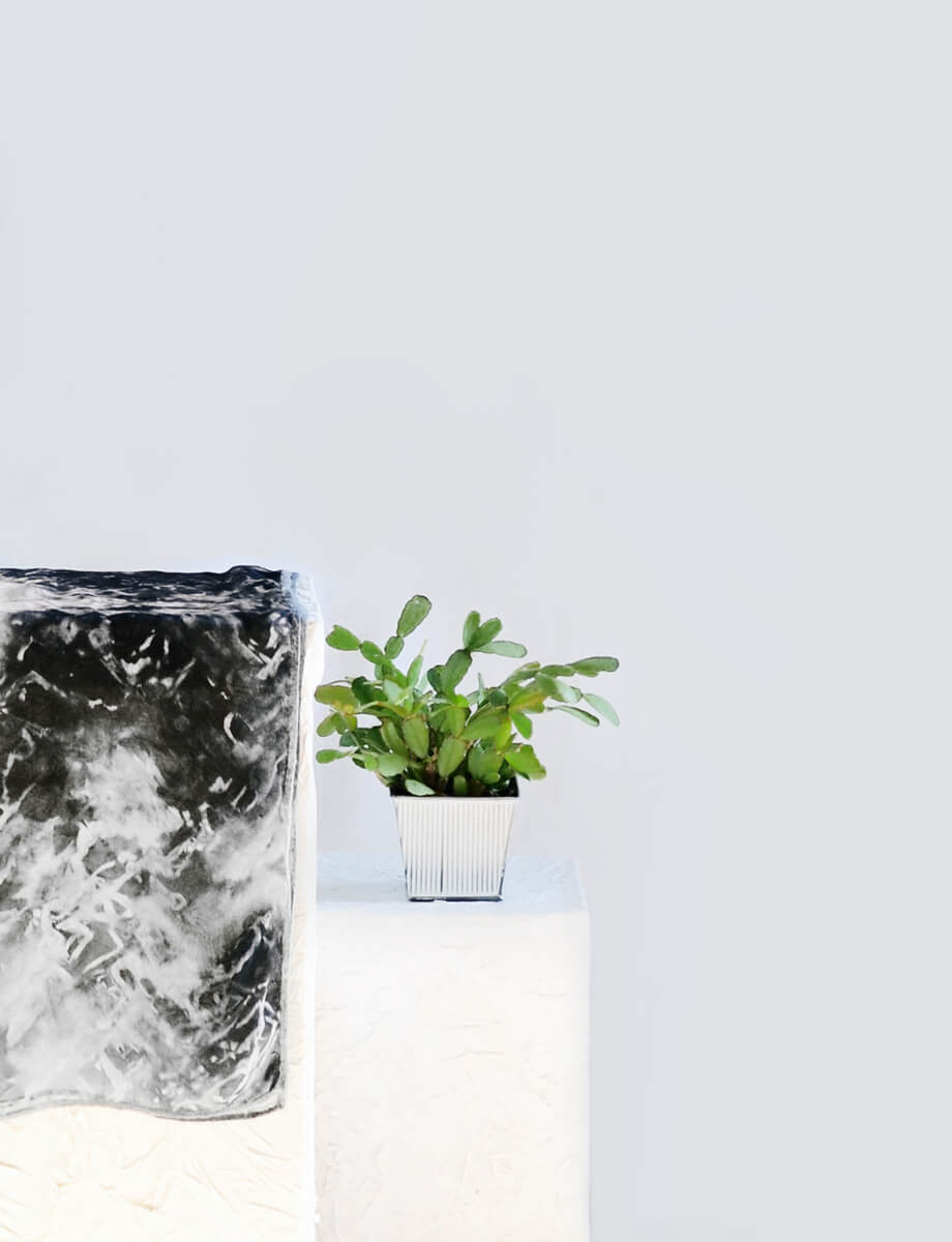
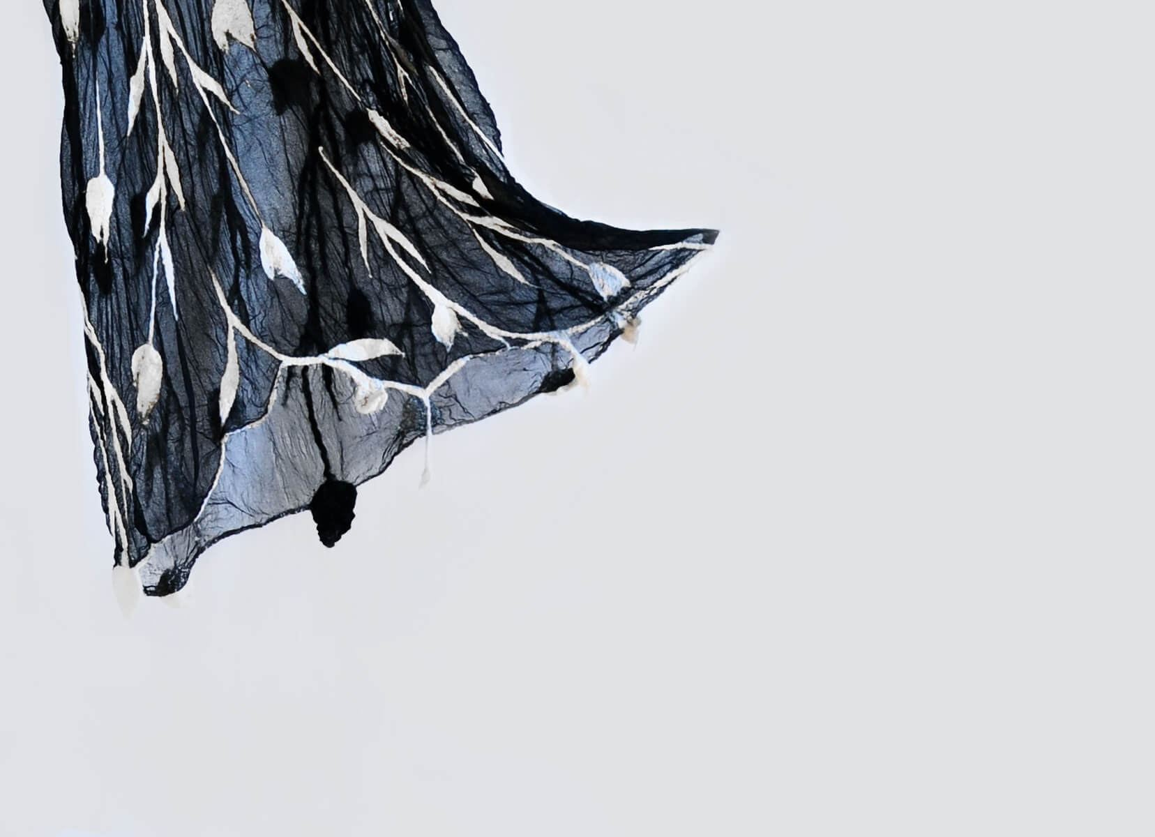
As fast fashion proliferates, some consumers are turning to products handcrafted according to traditional processes. Laura is an Italian artist who uses creativity and experimentation to make unique garments and accessories from natural and up-cycled materials.
To unify an eclectic product range, I have created a strategic framework for her brand, Antithesis, and consequently designed an identity that brings the strategy to life.

Creating a brand that heroes its new positioning and messaging through their visual representation
Strategy
From the beginning, it became clear that Laura’s creativity knew no bounds. In fact, at the time of the rebrand, the product range included 1000 unique pieces made of felt, stone and rubber that didn’t always share a common aesthetic. The research highlighted that consumers were struggling to understand what Antithesis stood for.
As a result, the strategy phase led to defining a strategic framework that allows for flexibility whilst communicating the value of the products and the brand.
Naming
The former name Crea arti vando (which translates to Creartify in English) wasn’t doing the brand justice. It highlighted the benefit to the artist but not to the consumer. Additionally, it proved difficult to spell in Italian and unsuitable for the English-speaking market, where the artist wanted to expand. As a result, Antithesis became the brand name. An opposition to mainstream, low-quality, disposable products. Something that our potential customer was very likely to stand for.
Identity
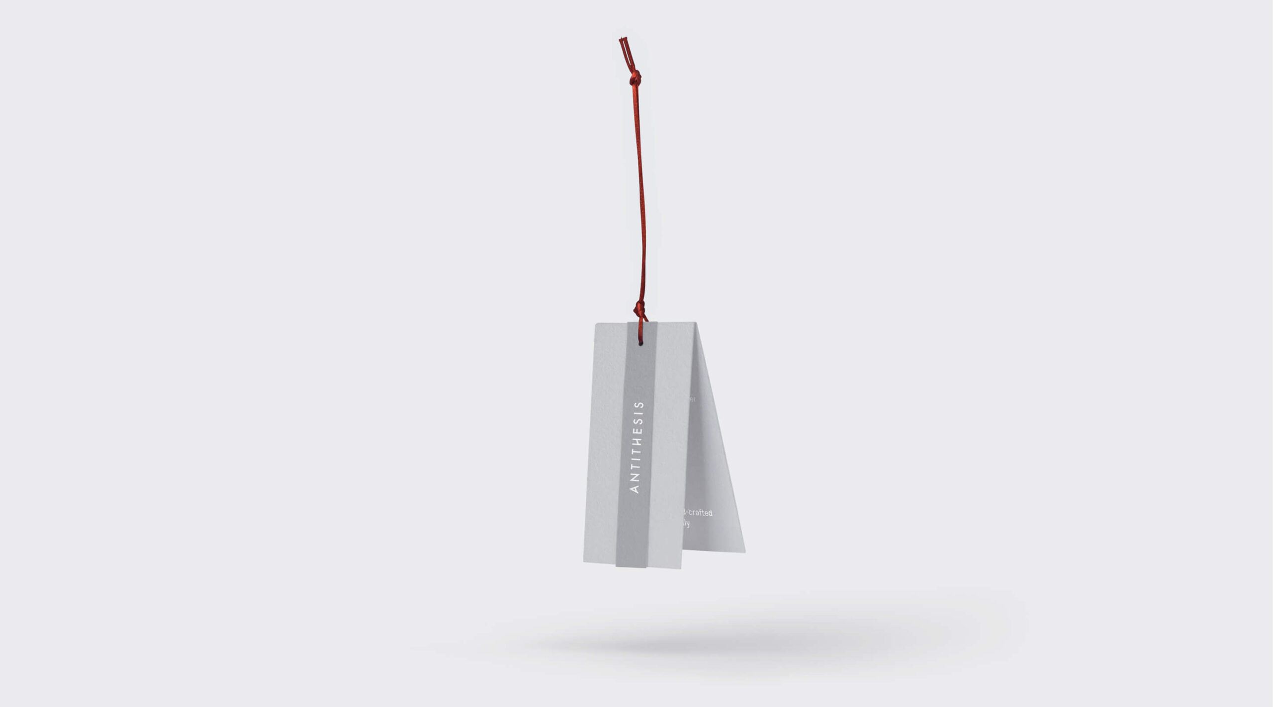
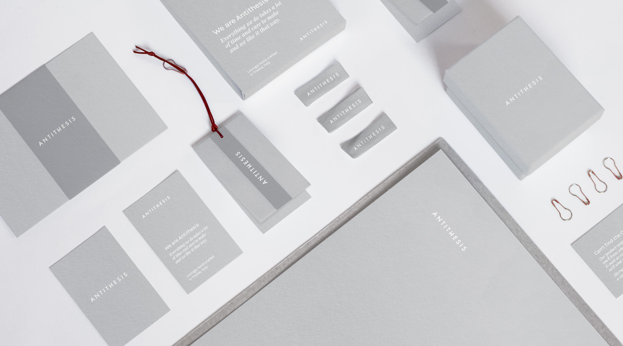
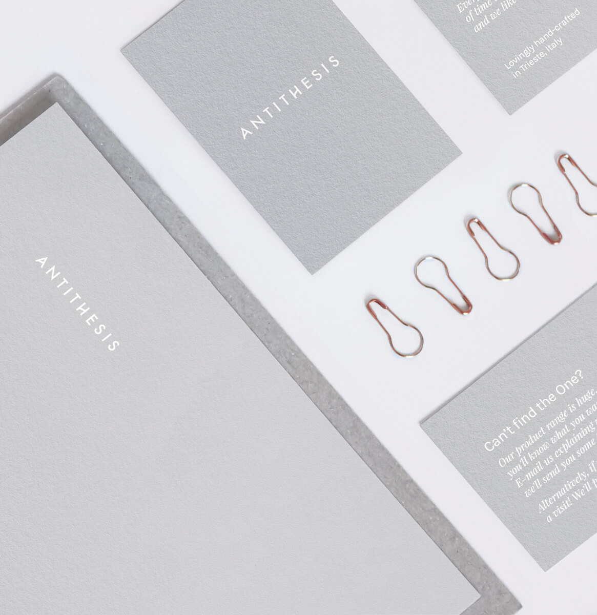
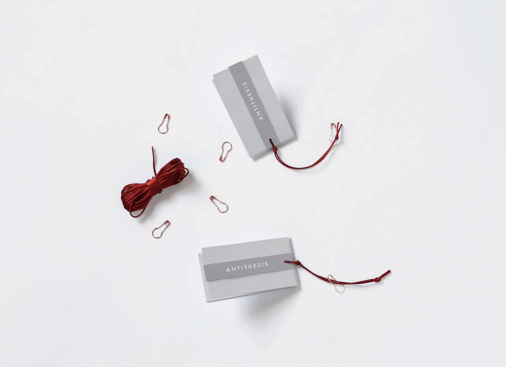
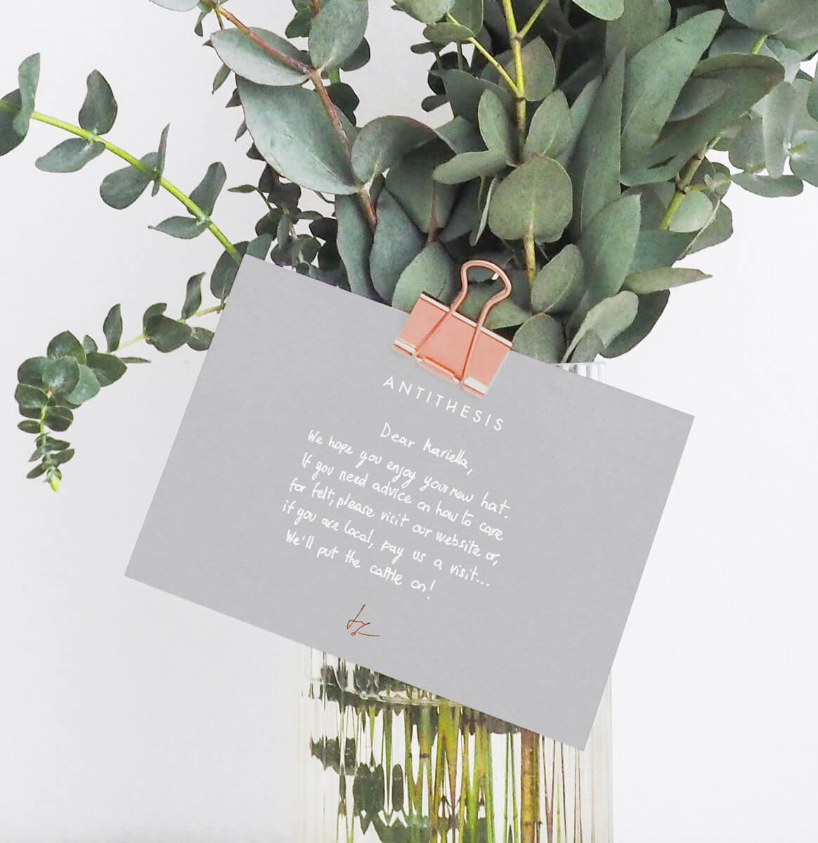
The identity is minimalistic and under-designed. It visually expresses the premium positioning of the products without adding an extra layer of complexity to a brand that already struggles to get its message across. Many little details feature throughout the identity to communicate value. These include, for example, the hand-written artist’s signature, a combination of printing & hand-writing and limited editions.

Tone of voice and messaging
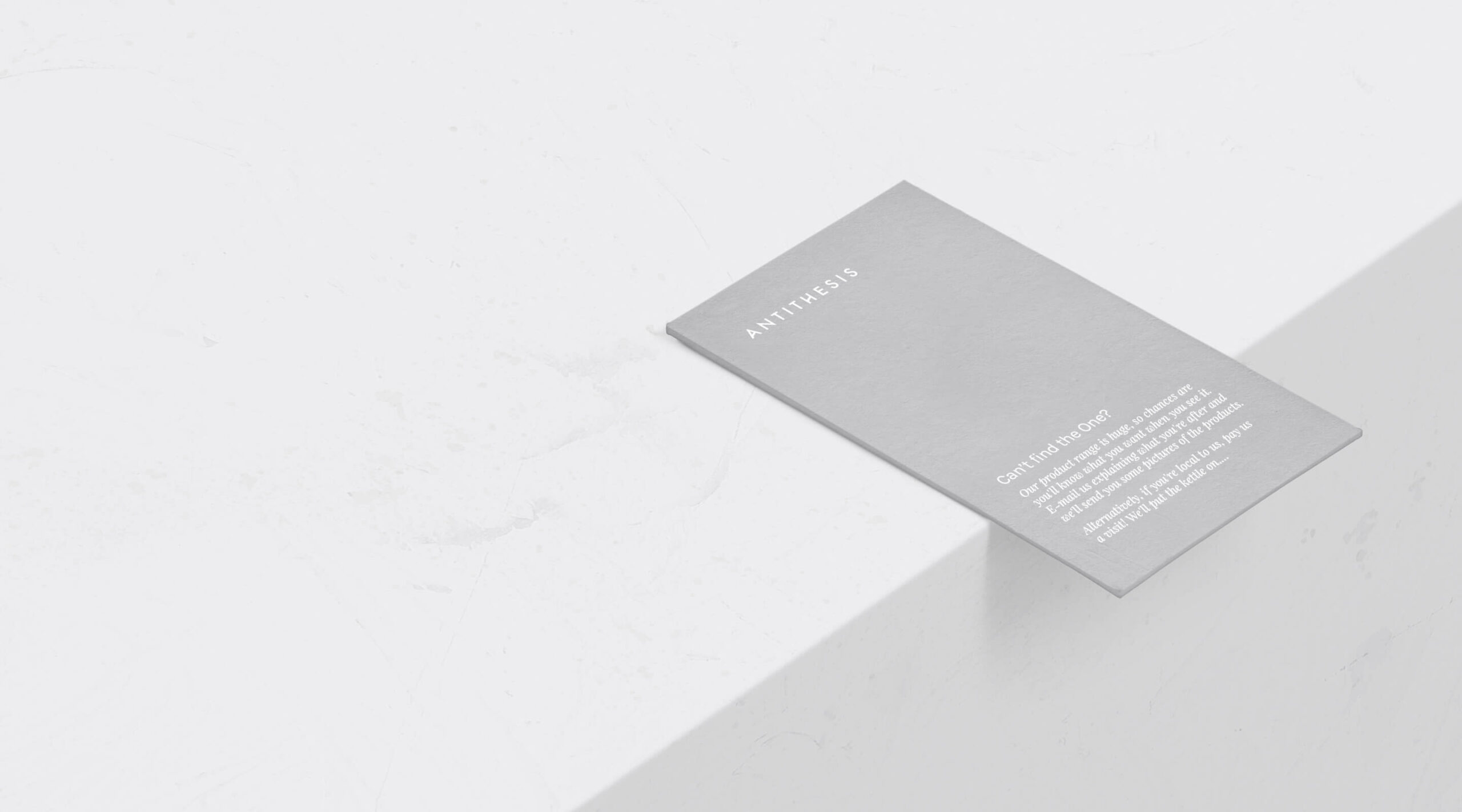
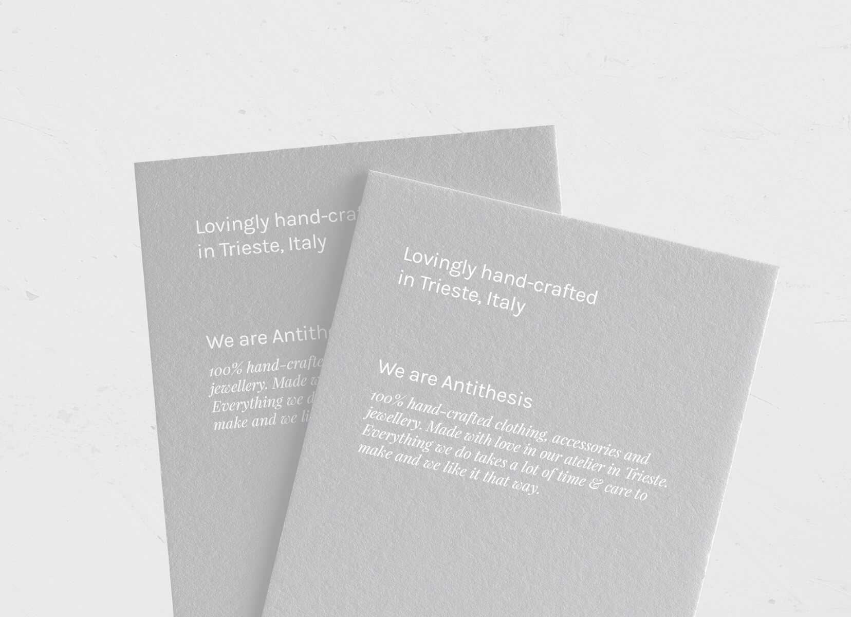
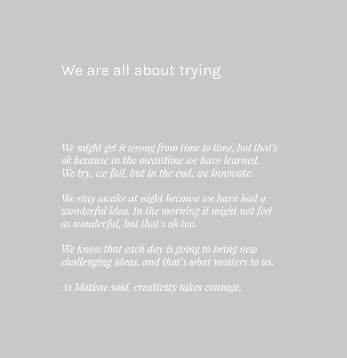
To further clarify the positioning of the products, messaging features predominantly. Defining values and Tone Of Voice led to creating an emotive brand expression that narrates creativity in its purest form. Some practical messaging complements this expression, telling the story of the products and the processes involved behind them.
Curating collections
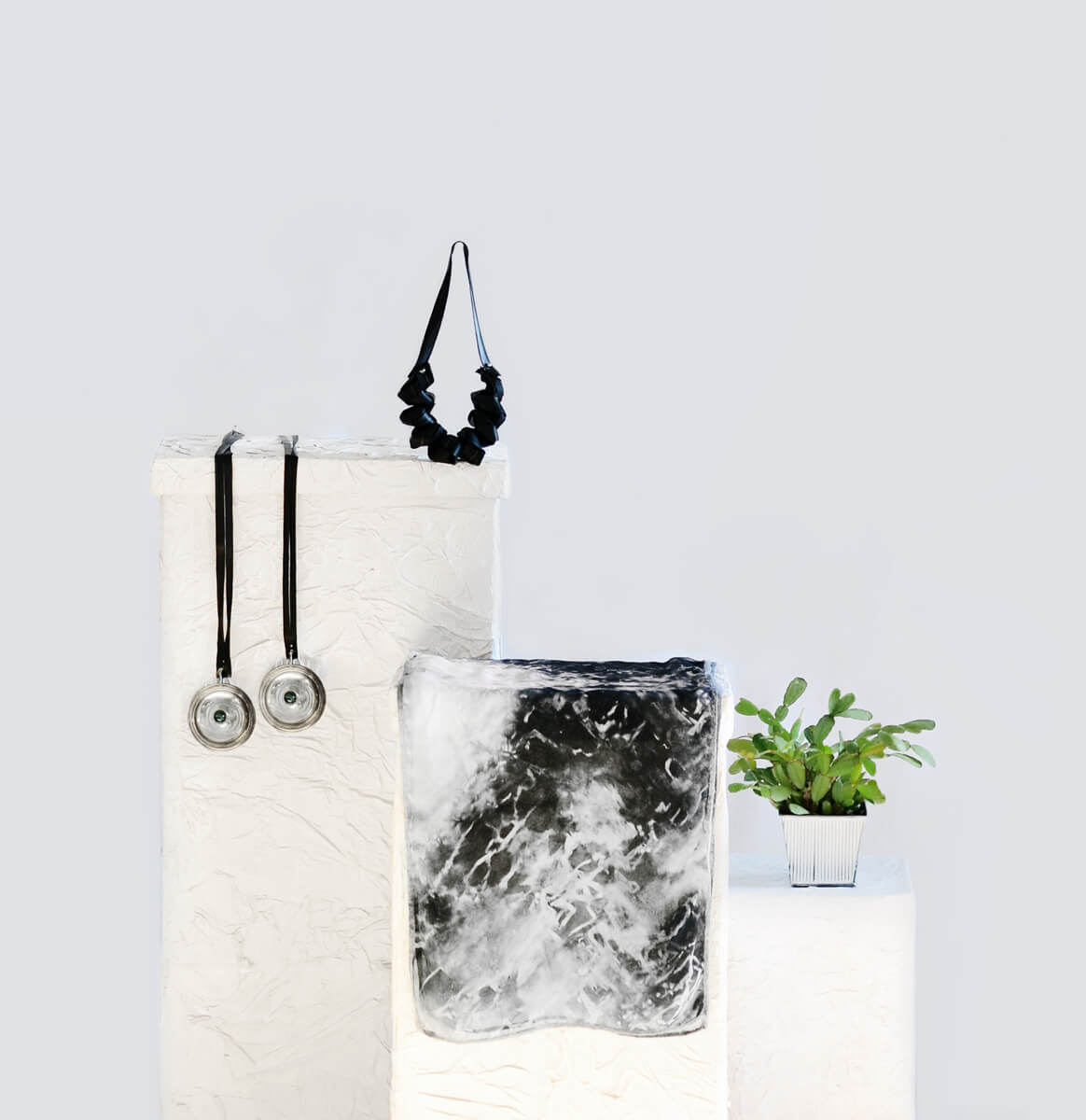
Introducing product collections helped to simplify the offer in the eyes of the consumer. Grouping items that share a mood ensured a consistent aesthetic. In addition, this allowed people to explore the range without feeling overwhelmed by its eclectic nature. The black and white collection was the first to be created.
