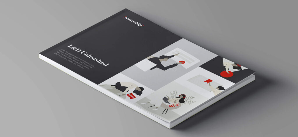
Learnship provides business language and cross-cultural training to companies aiming to relocate their employees and improve collaboration within global teams. Following an acquisition, consolidating the offering into a cohesive identity was crucial, along with establishing the new Learnship as a reliable provider.
I have created the identity for Learnship and consequently designed a multilingual website, a product style guide and various campaign assets to bring the brand to life.
Creative strategy
Initial research highlighted a prevalent issue in the online learning landscape: decision-makers often viewed digital learning as inferior to traditional, classroom-based services—deeming it low-quality, ineffective, and unengaging. Consequently, building authority and instilling trust emerged as crucial objectives for the new Learnship.
But that’s not all. We also discovered that learner engagement was the primary metric in procurement evaluations. So, it became evident that besides catering to corporate decision-makers, we needed to create a brand that resonated with the end-user—the learner.
Crafting a flexible identity that meets the unique needs of both corporate decision-makers and individual learners
Identity Design
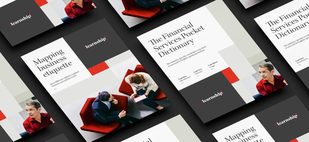
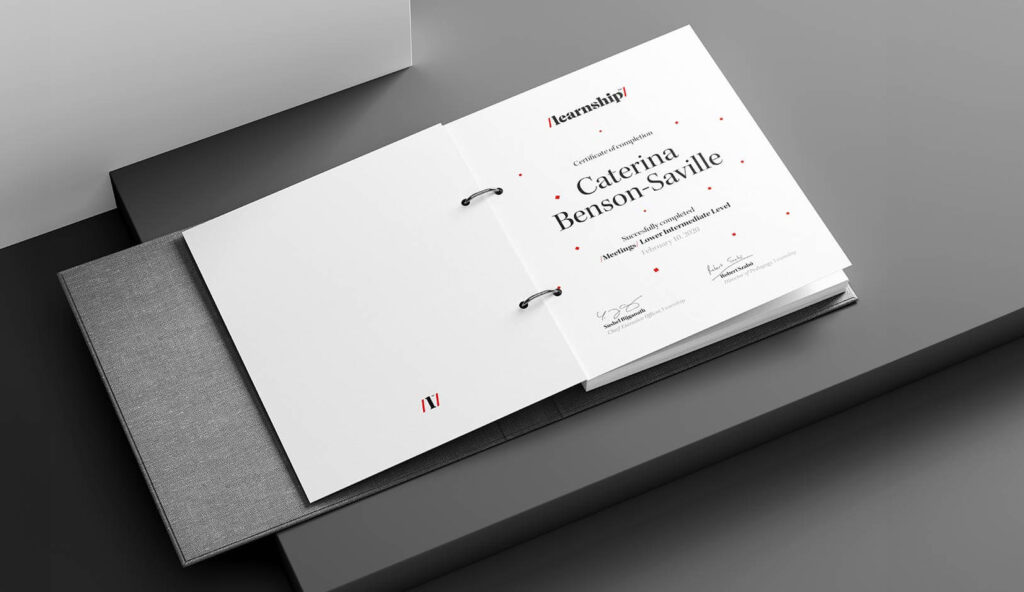
The structured, confident layouts and assertive colour palette are designed to appeal to corporate buyers while the use of illustration and a shift in font usage softened touch points geared toward learners.
A logo inspired by phonetic symbols.
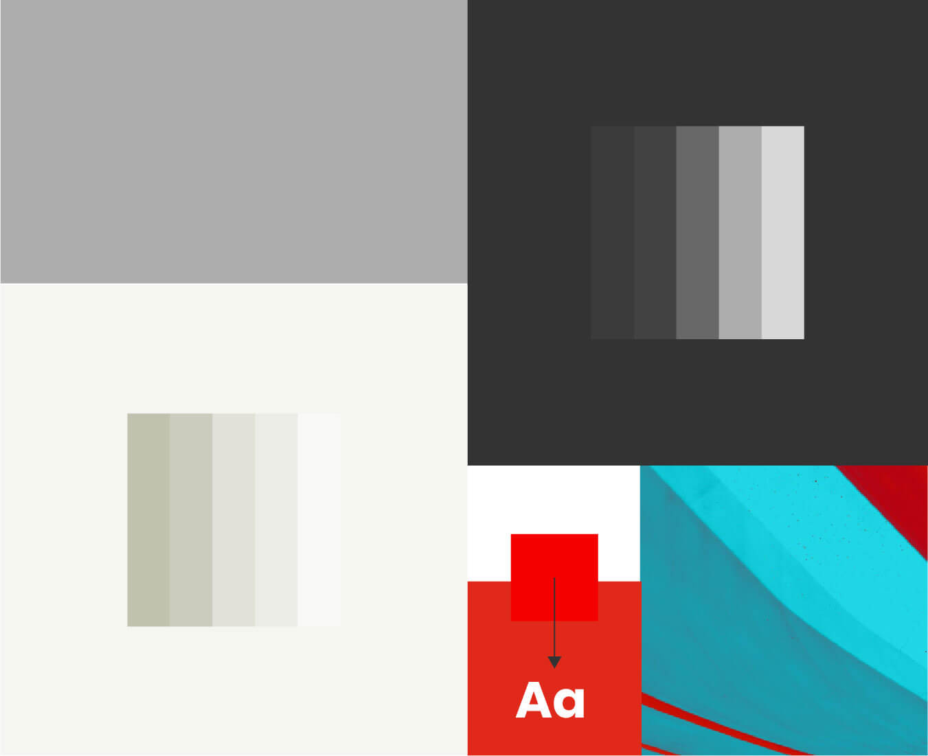
A neutral colour scheme built around the Learnship Red, and an Aqua accent for interactivity.
People’s images humanise the brand and are graded to align with the colour palette.
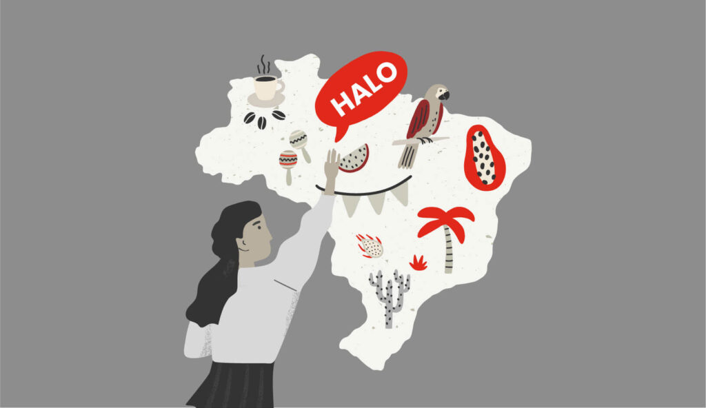
Abstract images reflect the brand’s ethos of diversity and serve as versatile backgrounds.
Grids based on the golden ratio regulate the layout to create visual harmony.
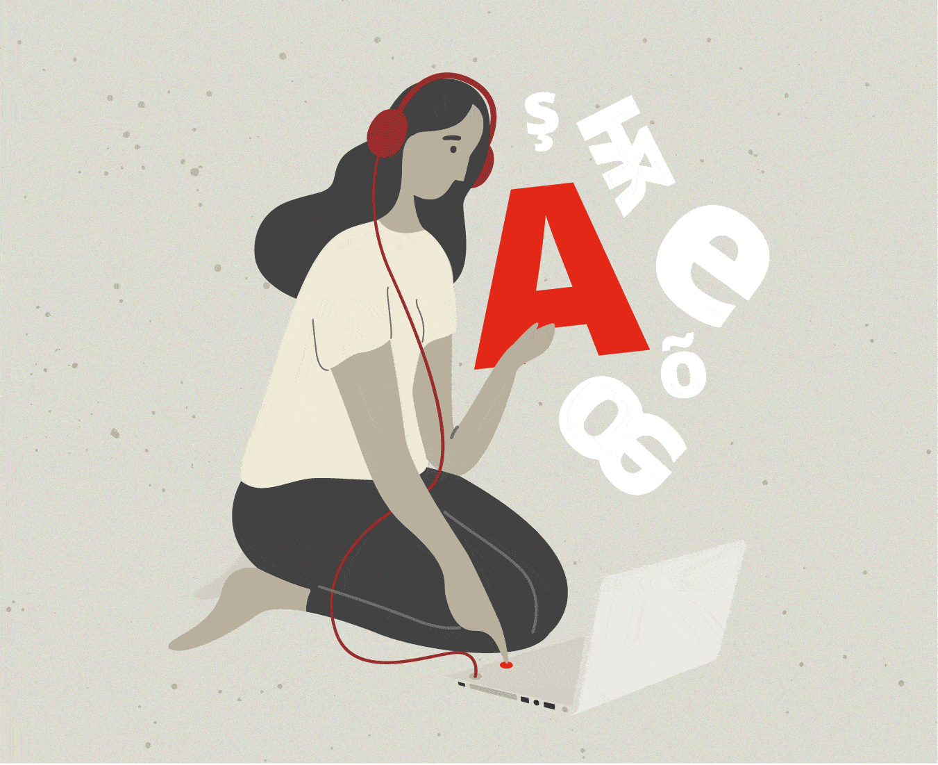
A friendly illustration style, designed with the learner in mind, helps to communicate the value of each product.
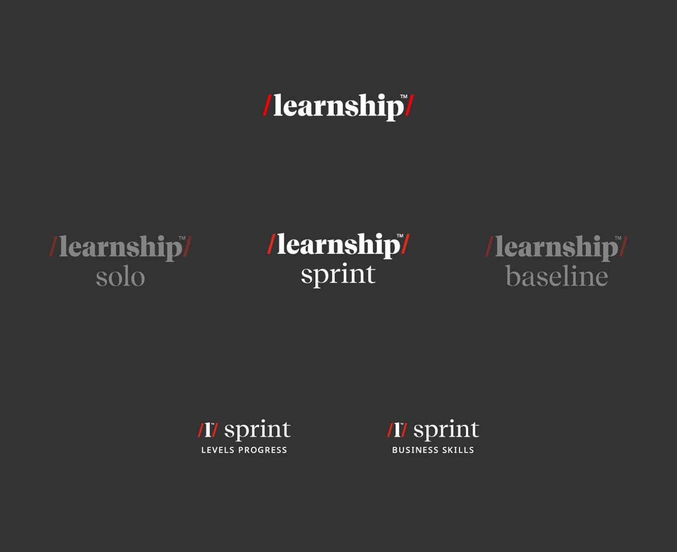
Sub-brands: the logo system can flex across a diverse product range comprising multiple levels.
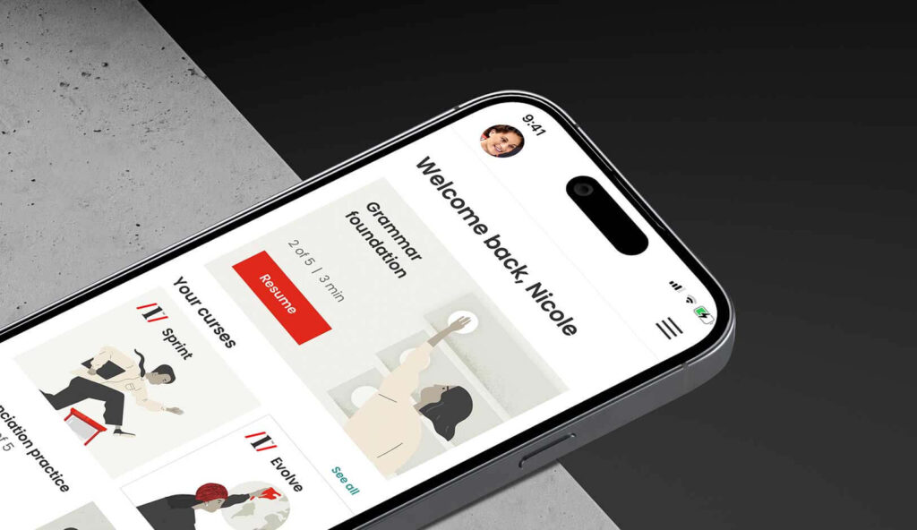
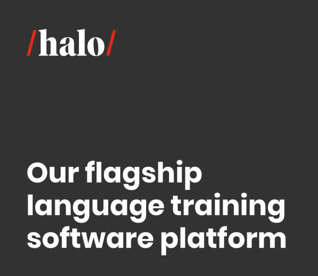
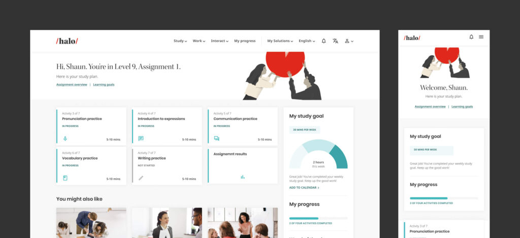
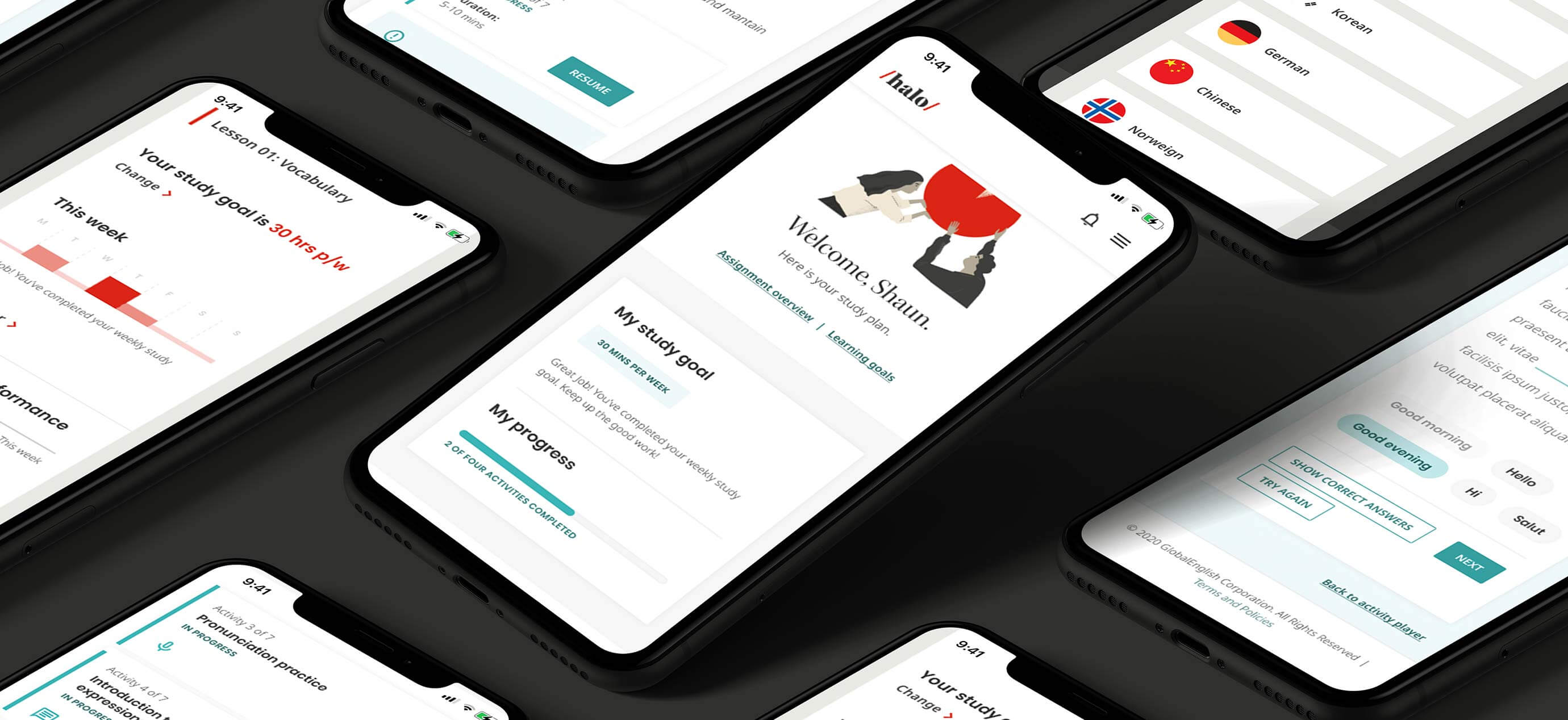
Meet Halo
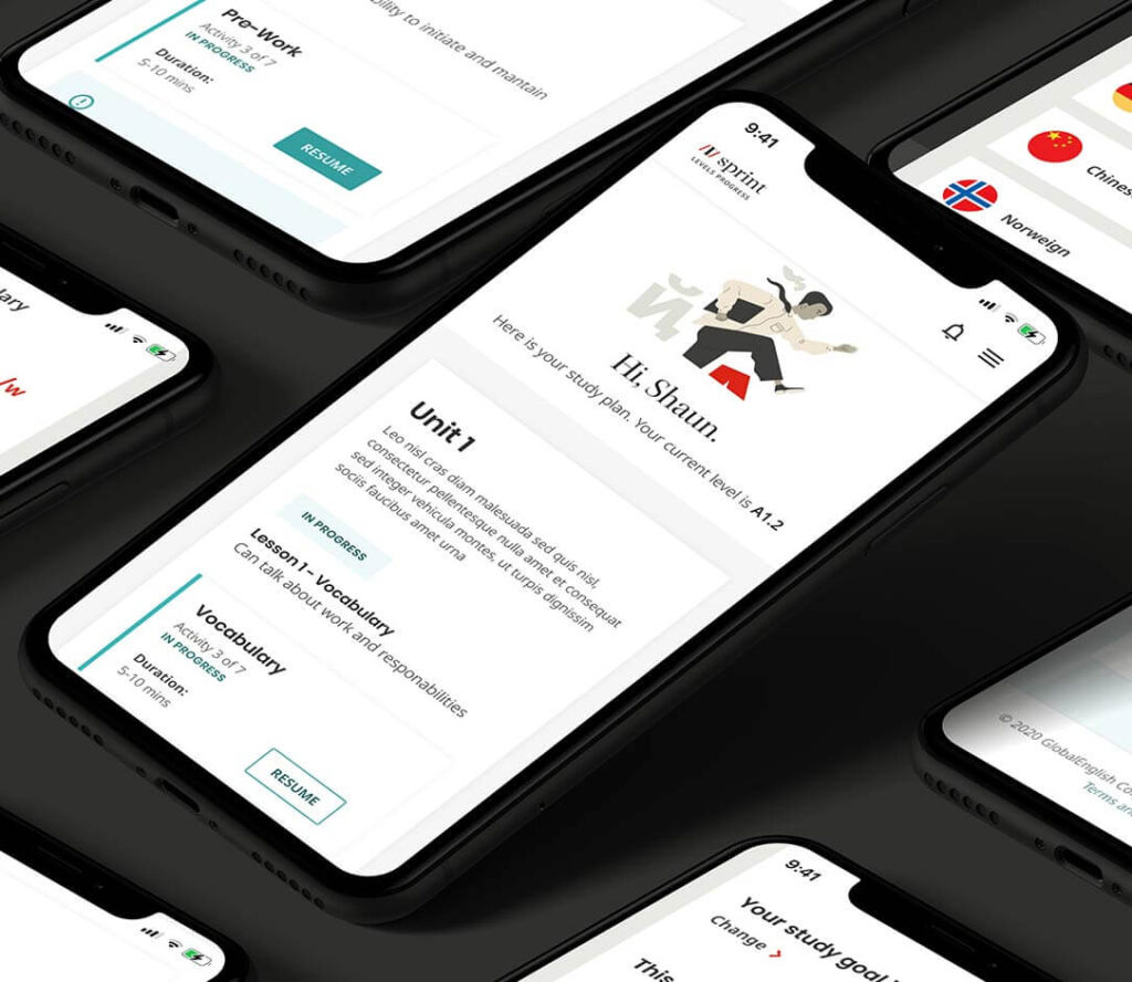
The Halo platform serves as the central access point for all courses. While administrators utilise it to monitor employee progress, the platform prioritises empowering learners.
Here, a perceptible shift in visual language occurs: typography gets friendlier, illustrations take centre stage, and layouts become less rigid. This transition represents a shift from building trust to prioritising the learner’s experience.
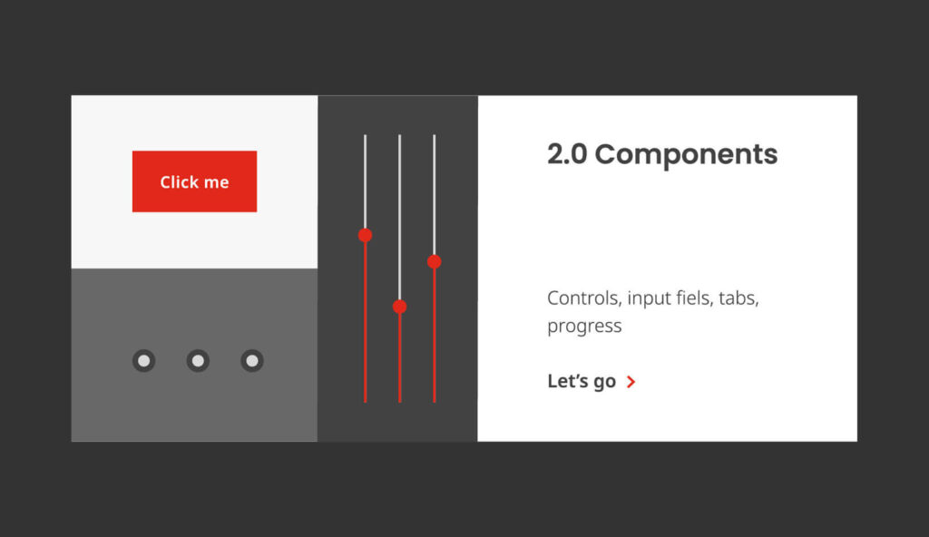
Website design and product style guide
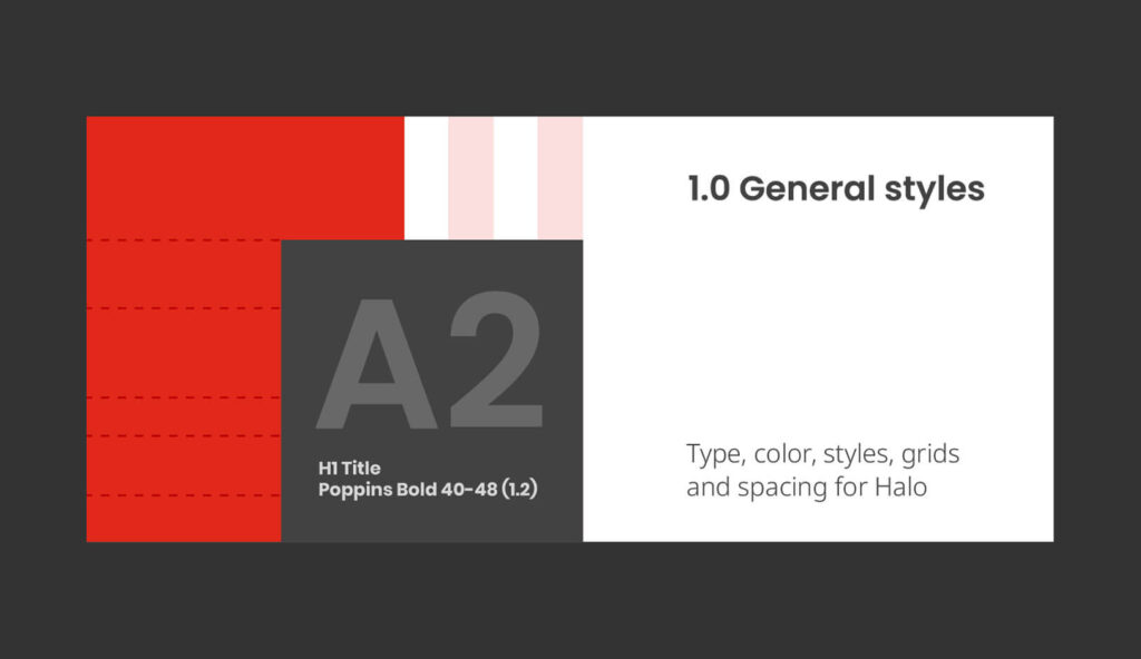
Upon finalising the identity, efforts transitioned to developing a new website and UI style guides for the Halo platform and products. The use of an atomic design system ensured consistency and streamlined production. With over 60 pages available in seven languages, typography deserved particular attention, especially in languages featuring non-Latin characters. The website was developed by a fully remote, multidisciplinary Scrum team.
Finally, a product interface style guide was created to help the client’s product team establish a style for the refresh of the product portal.
Campaigns
Post-rebrand, Learnship launched several campaigns to introduce the new brand to the market. Collaborating closely, the team and I crafted digital ads and content pieces, providing invaluable insights into the flexibility and adaptability of the brand identity.
Specialto:
Mathilde Evens and Matt Roundell, who helped to produce some illustrations and abstract images and to design some content pieces post-rebrand. And to Edu Escanho for bringing the illustrations to life through animation.