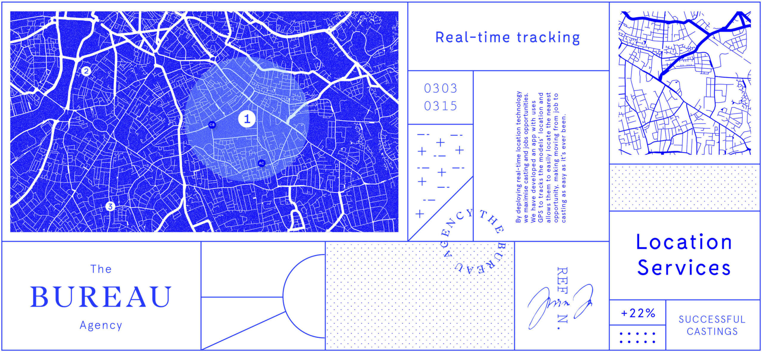
In the era of disruption, the modelling industry was standing still. Within this stagnant landscape, model management agency The Bureau improves the experience for brands, models and consumers by combining technology and technical knowledge.
To help them establish the agency as a reference point in its industry, I have chosen a new name and designed an identity built on an evocative brand story.
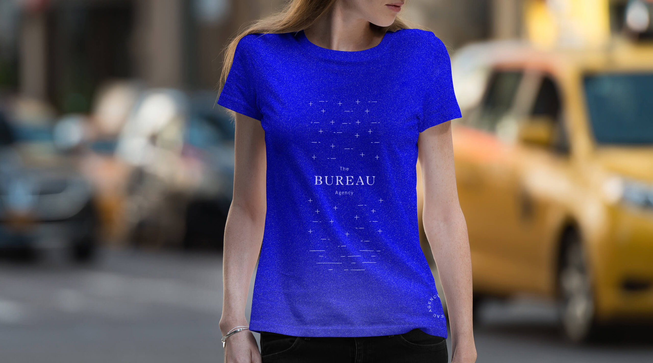
Taking a distance from the modelling industry’s visual standards to help an aspiring leader reinvent the norm
Naming
Four naming routes were created, each focusing on a different aspect of the business. Out of the four proposals, The Bureau became the winner. A new name that confidently anticipates the leading role that the agency is taking by making a bold statement of authority.
Description
Aim
Shortlist
Longlist
Technical route
Express the innovative nature of the business and the advantage given by the employment of cutting-edge technology.
Orbit
Parallel degree / Sharp Signal / Incipit
Digital route
Position the company as a digital service, as opposed to a traditional brand, aligning it to the many start-ups currently thriving.
Aestec
Fashionly / Modelfy / Booklify
Evocative route
Centred around the concept of uniqueness and individuality, referencing the company’s ability to select the perfect match for any brief.
Limited edition
The Singulars / Untyped / One of a kind
Authoritative route
Establish the company as a leading business that is always ahead of the curve.
The Bureau
The Front / The Drapery / The Guild
From name to brand story
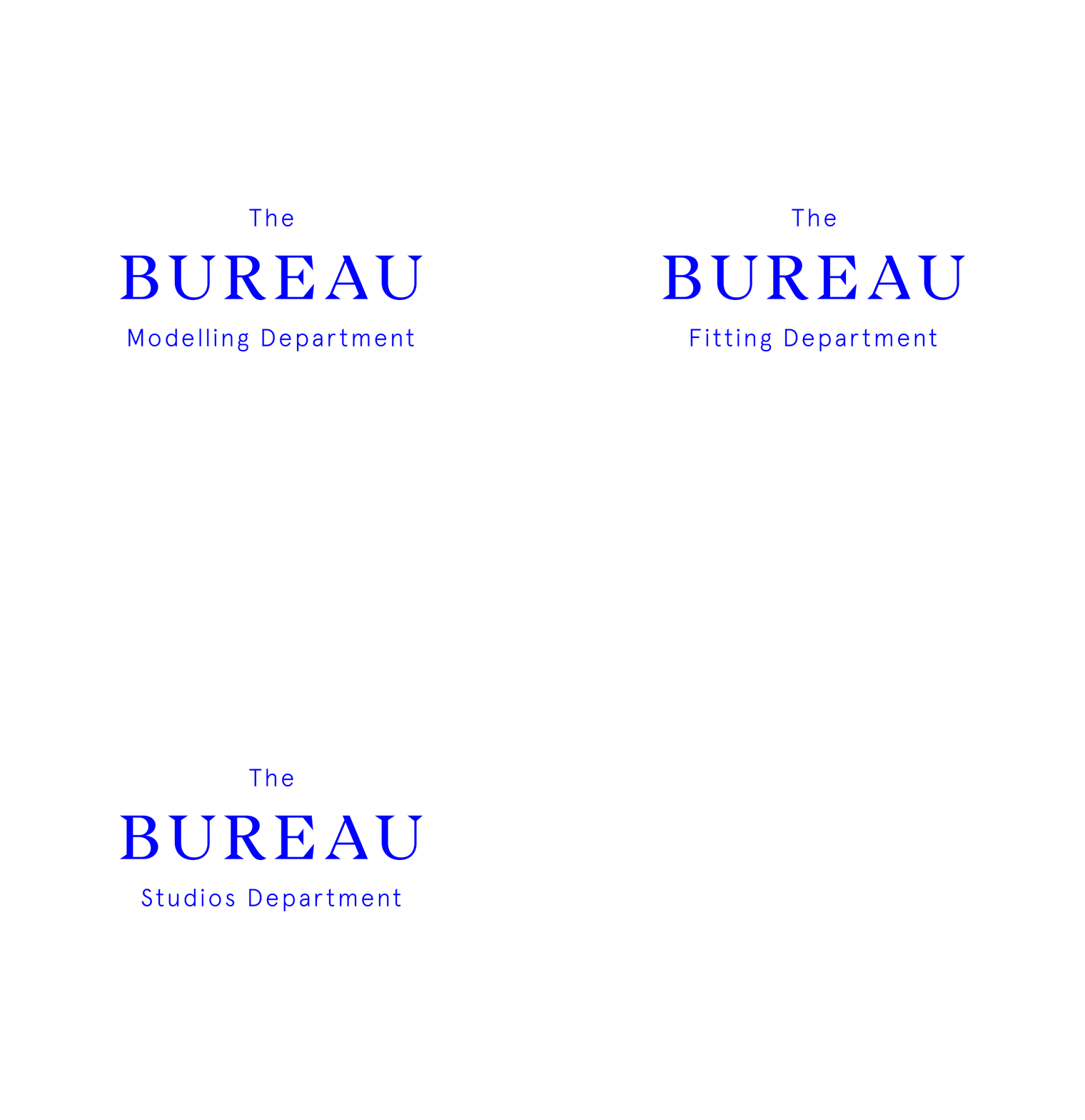
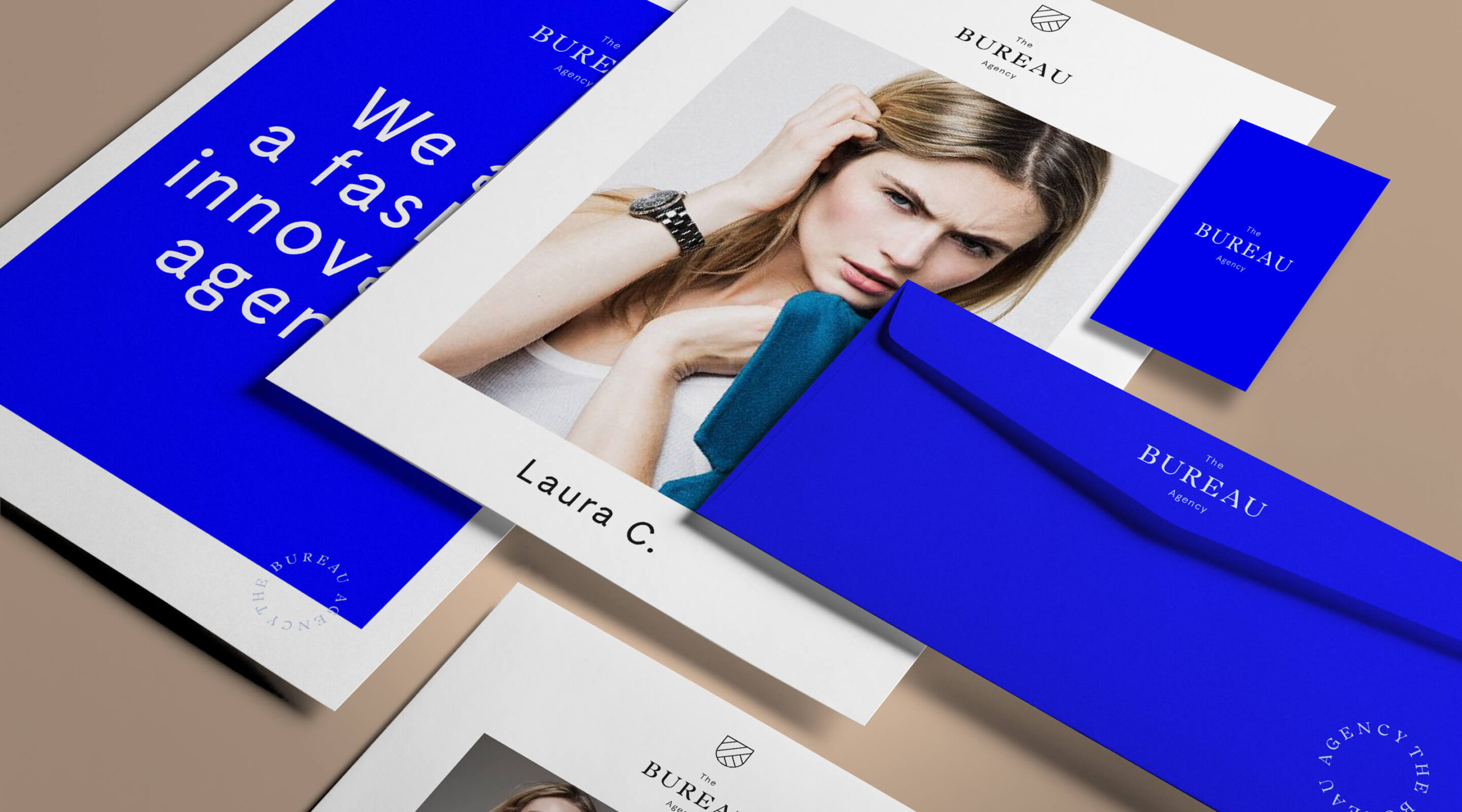
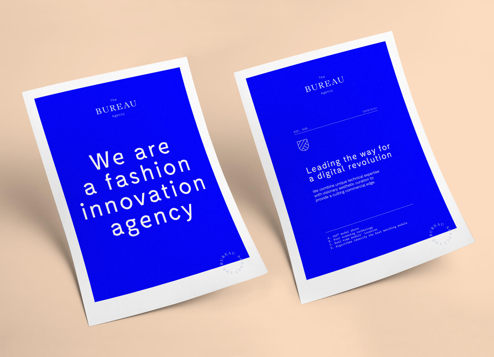
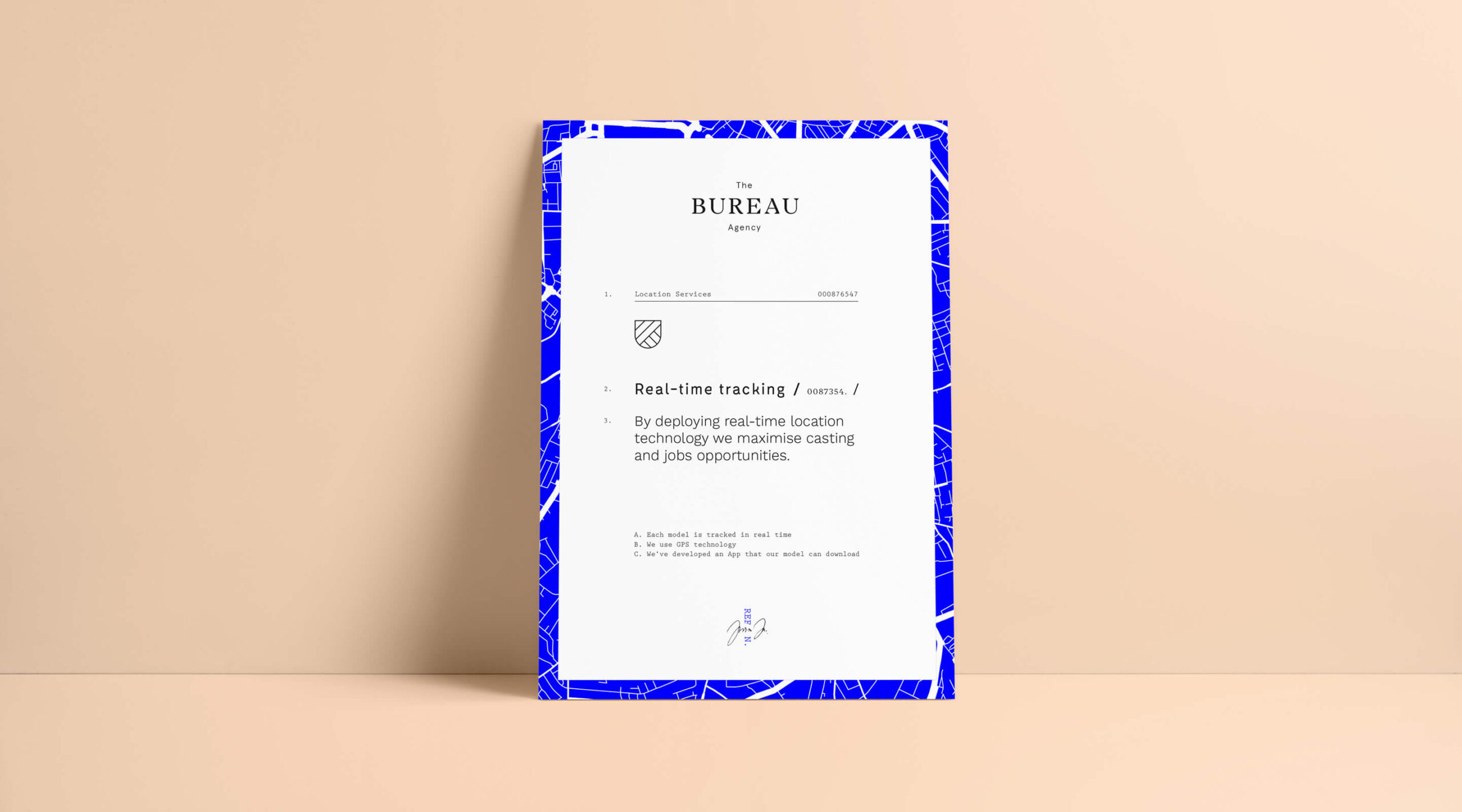
The brand visual story generates from the institutional connotation of the name. Elements associated with government bodies such as stamps, crests and structured layouts, inspired the symbol and visual language. The brand architecture is also infused with the story that spins off the name, with sub-brands featuring the word Department.
Supporting visual language
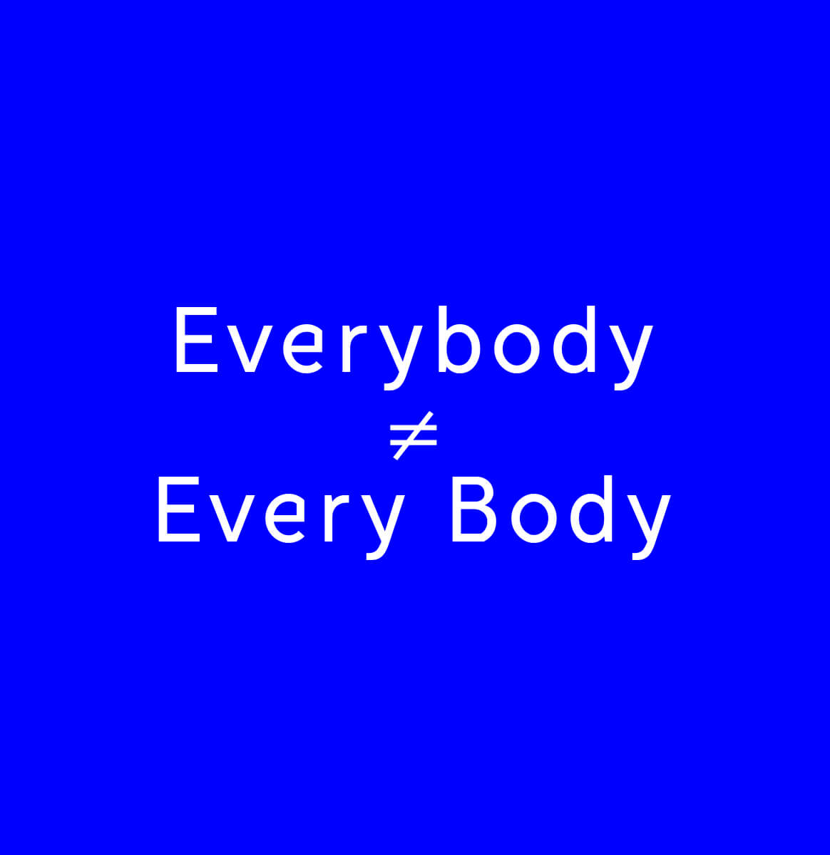
The style is hip and almost brutalist to resonate with the young, trend-conscious audience identified during the strategy stage. The simple illustrations also help visualise the main differentiation points that make the agency unique.
